Groups are the color menus that the employees use at the POS screen to order sales items. Groups and keys will allow you to configure the color of your keys and their layout on the POS screen. There can be many different groups, for instance, Breakfast menu, Lunch menu, Evening Menu, Bar Menu, etc.
Keys are the actual cells or buttons within groups. Each key can be linked to another menu screen or a sales item. They are the physical buttons that the employees press to interect with the POS.
Login to the Veloce Back-Office.
Start the Point of Sale Control module.
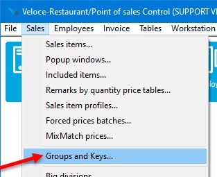
Click on the Sales menu and select the Groups and Keys... option.
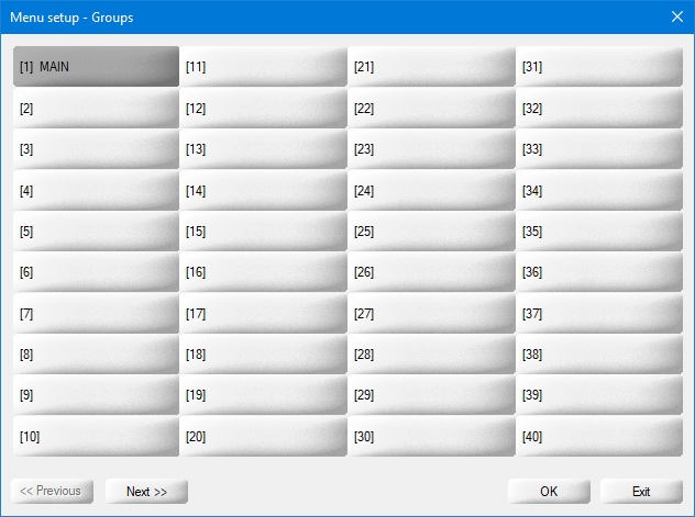
The list of Groups will appear. Click an existing group to edit it, or click an empty placeholder to create a new group.
Use the << Previous and Next >> buttons to navigate between screens. 100 group placeholders are available.
Click OK to modify the selected group.
Click Exit to close the groups list.
Related Topics
Button Functions - Detailed List
Once the appearance of the button is configured, click on the Function tab to configure what the button will actually be doing:
Select the button's function from the drop-down list. The function determines what the button will be used for. A button can order an item directly, call item screens, print the guest check and many more options.
See Button Functions - Detailed List for a complete list and description of all available button functions.
This field becomes vailable if the Auto. BAR order, Digit, Birth date (MMYY), External identifier assignation, No tax mode, Variance selector, functions are selected.
This option becomes vailable when the Sales item function is selected.
From the drop-down list, select the sales item that will be ordered using this button.
This option becomes vailable when the Item screen function is selected.
Select the desired item screen from the drop-down list.
This option becomes vailable when the Item division function is selected.
Select a division from the drop-down list.
This option becomes vailable when the Service selection function is selected.
Select the desired service from the drop-down list.
This option becomes vailable when the Employee selection function is selected.
By default, a button which will allow the user to select an employee at the POS will be created.
If you enable the checkbox next to the drop-down list, you will be able to select a specific employee from the list. Using this button at the POS will automatically select that employee instead of bringing up the list of employees.
This option becomes vailable when the Employee selection function is selected. This overrides the employee password requirement.
This option becomes vailable when the Employee selection function is selected. [...]
This option becomes vailable when the Group, Group jump or Group selection functions are selected.
This option becomes vailable when the Group jump function is selected. [...]
This option becomes vailable when the Mode selection function is selected.
Select the desired mode from the drop-down list.
This option becomes vailable when the Mode selection function is selected.
Enable this option to make the mode change permanent. If this option is disabled, the mode will return to the default mode once the order process is completed.
This option becomes vailable when the Payment button function is selected. [...]
This option becomes vailable when the Payment button function is selected.
Enable this option to prevent the printing of an invoice when using this button to apply a payment.
From the drop-down list, select the payment mode to use.
This option becomes vailable when the Reservation agenda link function is selected. [...]
This option becomes vailable when the Item price change function is selected. [...]
This option becomes vailable when the Item price change function is selected. [...]
This option becomes vailable when the Price level change function is selected.
Selec the desired price level from the drop-down list.
This option becomes vailable when the Discounts function is selected. [...]
This option becomes vailable when the BAR interface Size function is selected. [...]
This option becomes vailable when the BAR interface Size, Bar status, function is selected. [...]
This option becomes vailable when the Next item promo, Promo toggle mode, Promo + toggle mode, functions are selected.
Enter the discount percentage to apply.
This option becomes vailable when the Jump to order mode function is selected.
Select the appropriate order mode from the drop-down list.
This option becomes vailable when the Jump to BAR interface function is selected. [...]
This option becomes vailable when the Auto. BAR order, Show BAR interface, functions are selected. [...]
This option becomes vailable when the Printer status function is selected. [...]
This option becomes vailable when the Jump to BAR interface, Show BAR interface, functions are selected. [...]
This option becomes vailable when the Alternative section option is enabled. [...]
Related Topics
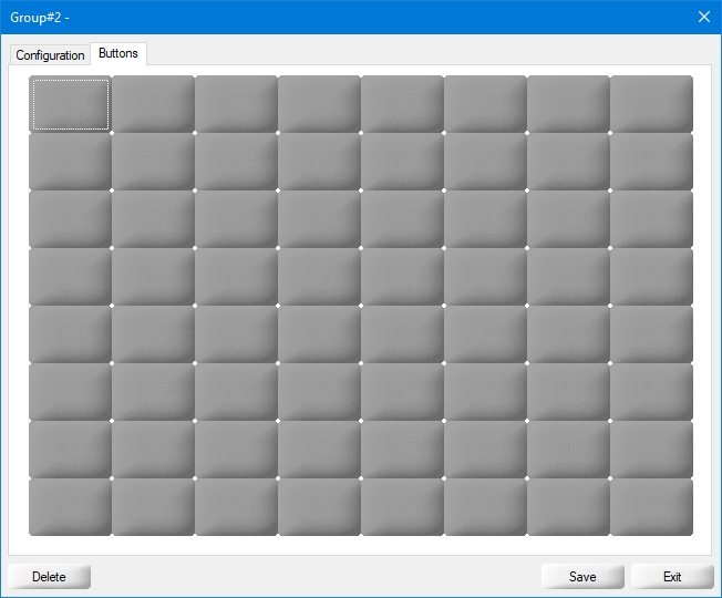
When an existing group is selected or a new group is created in the Groups and Keys screen, its properties open on the Configuration tab.
Click the Delete button to remove this group and all the buttons it contains.
Click the Save button to save changes and exit.
Click the Exit button to close this window without saving changes.
Type a meaningful name for this group.
Type an alternate name for this group. On multi-language setup, this could be the direct translation of the description.
Select the background color to use. The option By default will use the default color of the selected workstation theme. Other colors can be selected from the drop-down list.
Select this option to create a button grid with a custom number of rows and columns.
Enter the number of columns to use on the POS screen.
Enter the number of rows to use on the POS screen.
Select this option if the POS screen is used in portrait mode instead of landscape.
Select this option if this group is going to be used as a modifier selection screen allowing only a specific number of choices.
Enter the number of choices that will be allowed before the POS returns to the previous screen.
...
...
...
Click on the Buttons tab. This will display a grid of buttons arranged in the number of columns and rows defined in the Configuration screen. This functions as a preview of what the resulting POS screen will look like.
Related Topics
Group Configuration
Button Configuration
Button Functions
Button Functions - Detailed List
...
...
...
...
...
...
...
...
...
...
...
...
...
...
...
...
...
...
...
...
...
...
...
...
...
The button will display the entire selected group of keys.
...
...
...
This function creates a button that will display the contents of the selected division.
...
This function creates a button that will display the contents of the selected Item Screen.
...
...
...
...
...
...
...
...
...
...
This button is disabled.
...
...
...
...
...
...
...
...
...
...
...
...
...
...
...
...
...
...
...
...
...
...
...
...
...
...
...
It is recommended to assign this function to expanded buttons. This function will create an area where remarks and popups will be displayed.
It is recommended to assign this function to expanded buttons. This function will create an area where the contents of item screens, remarks, popups and item divisions will be displayed.
...
...
...
...
...
...
...
...
...
...
Related Topics
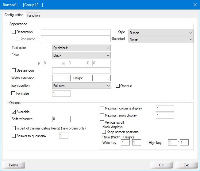
Once the group configuration is completed, click on a button on the grid to bring up its configuration options:
By default, the text on any button will be determined by the button's function. For instance, if the button calls an item screen, the item screen's description will be displayed on the button. You can override this by enabling the checkbox next to the Description field and typing a different description here.
This option will become available if the description checkbox is enabled. Use the 2nd name field to override the alternate description of the element called by this button.
From the drop-down list, select the visual style of the button
...
Select the desired text color from the drop-down list.
Select the desired button color from the drop-down list. selecting the Custom option will give access to the R, G, B fields, which allows you to create your own colors by entering RGB values from 0 to 255 in each field.
Enable this option to add an icon to the button, then type the image file name in the text field, without the file extension. For instance, if the name of the image is "Steak.png", simply type "Steak". Icons are stored in C:\VELOCE\WSDATA\WIN\ICONS\. This feature supports .png, .jpg and .bmp image types.
Buttons can be extended horizontally up to the maximum number of columns configured for the group. For example, if you enter 2 in this field, the button would become 2 columns wide.
Buttons can be extended vertically up to the maximum number of rows configured for the group. For example, if you enter 2 in this field, the button would become 2 rows high.
Select the icon's position on the button.
Enable this option so that the icon will hide everything beneath it.
By default the font size will automatically adapt to the available space on the button. You can override this by enabling this option and setting a custom font size for the text displayed on the button.
Enable this option to make the key visible on the POS screen. Disable this option to hide this key.
...
...
...
...
...
...
...
...
...
...
Related Topics


